
Blending Meat and Plants into a Bold New Identity :BUMP
• LOGO • BRAND SYSTEM • PACKAGING • WEBSITE • ART DIRECTION
BUMP was created to re-imagine what meat could be—without compromise. By blending Canadian beef with prairie-grown plant protein, the brand offers a delicious, sustainable option that still tastes and cooks like the real thing. To bring this vision to life, we built a bold new identity from the ground up, including branding, logo, packaging, and a digital presence that speaks directly to modern, curious eaters.
Objective: Create a cohesive brand identity that communicates BUMP’s unique “meat + plants” story while appealing to both meat lovers and sustainability-minded consumers.
Communication Goal: Position BUMP as a fresh, innovative choice—familiar enough for meat eaters, yet exciting for those looking to reduce their footprint without sacrificing taste.
Execution: From a confident logo and packaging system with clear flavour and product cues, to a website that blends storytelling, recipes, and product education, every element was designed to balance science and nature. The result: a unified brand that feels approachable, modern, and unmistakably BUMP.

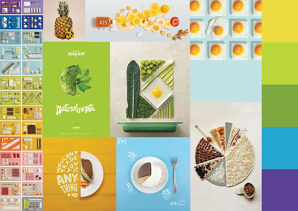
Bright, graphic, and unexpected, this was the approved moodboard. The use of bold shapes and colours shows how different parts come together - capturing balance and unity as the essence of the brand.

The challenge was to create an identity capable of conveying BUMP’s dual soul. The logo’s 70–30 split embodies the product’s meat-to-plant ratio, while fresh green tones signal vibrancy and nature. By blending geometry and fluidity, and pairing it with clean, modern typography, the design becomes both bold and refined - a visual system that makes science simple and the brand unmistakably fresh.


Pushing BUMP’s duality, we created a bold graphic system where geometry meets organic pattern. The halftone cow - later extended to the burger and pig - fuses natural leaf motifs with modern dot textures, symbolizing the meeting of plant and protein. The use of halftone, with its roots in printmaking and visual reduction, reinforces the idea of breaking an image into component parts, then rebuilding it into something new. This mirrors BUMP’s own philosophy: different elements, working together, to create a whole greater than the sum of its parts. The patchwork effect is playful and contemporary, while still grounded in nature’s palette and rhythm.


.png)

.png)
.png)


